Threads
Studio NARI gave Threads, Meta’s app for public conversation, a wordmark and glyph of its own, built on the Trending Chisel: directional cuts inspired by chisel-tip markers. The identity steps out of Instagram’s shadow, stays native to the Meta ecosystem and scales from the app icon to campaigns and live moments.
Client
Meta
Credits
Studio NARI: Caterina Bianchini (Executive Creative Director), Julien Queyrane (Creative Director), Elliot Charles (Strategist), Lauren Davidson (Design Lead), Charley Ray and Dom Vine (Senior Designers), Chi-Long Trieu (Type Director), Alexis Gargaloni (Typographer), Jake Richardson and Ron Daniels (Motion Designers), Amber Scott-Worthington (Project Manager). Meta: Christopher Clare (Head of Design, Threads), Hannah May (Executive Producer), Brett Itaya and Christy Silva (Creative Directors), Oliver Thein (Design Lead), Aliza Grant and Mads Jakob Poulsen (Designers), Gui Schneider (Product Designer).
Typography
Custom wordmark and glyph by Studio NARI
The brief
Threads had grown beyond its launch identity, yet it still read as an extension of Instagram: its wordmark borrowed heavily from Instagram Sans and lacked the distinctiveness to stand on its own. At the same time, public conversation was becoming faster, more participatory and more shaped by live cultural moments. Meta asked Studio NARI for a standalone wordmark and glyph. The real challenge was to define how live public conversation should feel in typographic form, in an identity that scales across product, campaigns and future brand systems.
The system
The wordmark is built on the Trending Chisel, a construction principle drawn from chisel-tip markers and the act of highlighting what matters now. Directional cuts sit where the eye already expects movement, at the transitions between stems and curves, and hold back everywhere else. The “t”, “h”, “r” and “a” do the most work in breaking from Instagram Sans, a single-storey “a” replaces the double-storey one, and the word leans forward in italic: completely bespoke, drawn as the base of a custom typographic language for the brand.
The identity
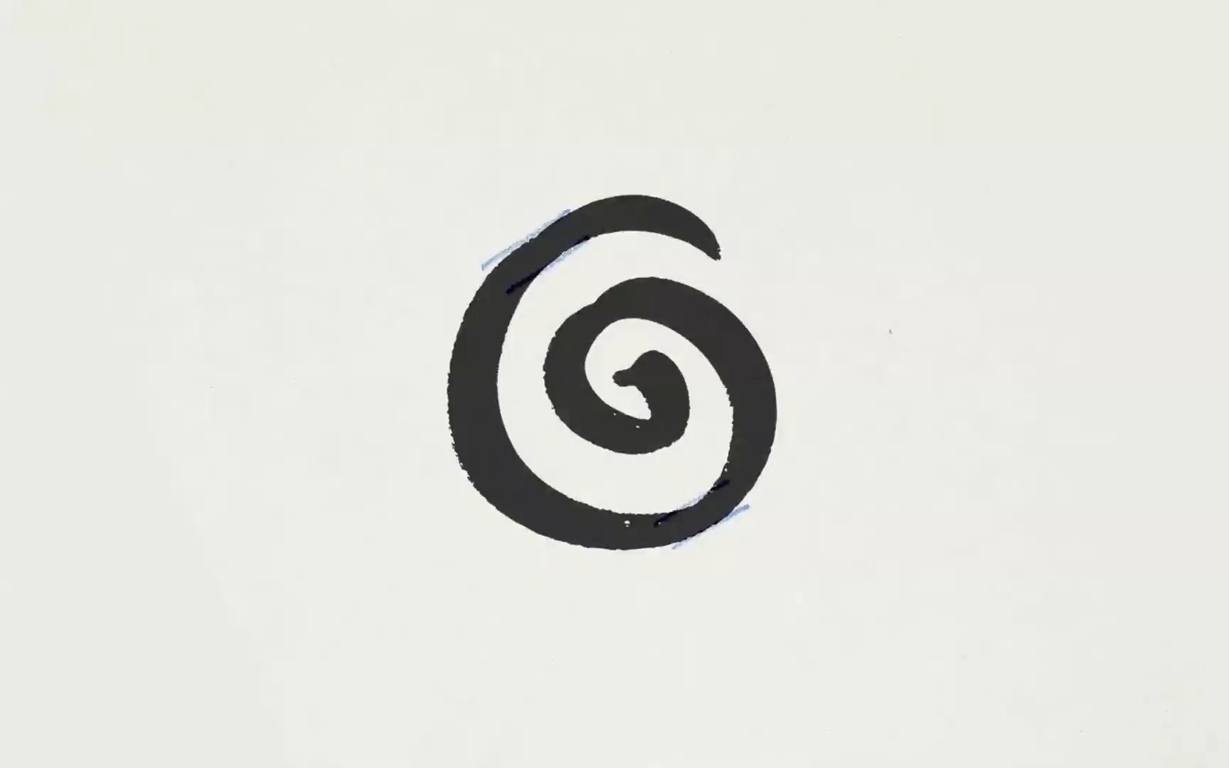
The @-inspired glyph keeps its looping structure, now drawn as one continuous line with the same directional cuts, and reads clearly down to the app icon and its notification badge. In product the wordmark stays clear and functional, across the feed, the Apple Watch and the browser. In campaigns and live moments the chisel logic grows more expressive, built to flex across sport, music and entertainment: on billboards and a double-decker bus under the line “Join the conversation”, on an arena screen, a basketball court and merchandise.
Outcome
The new wordmark and glyph rolled out to Threads users on 11 May 2026, giving the app a visual behaviour of its own, tied to how conversation moves through culture: fast, directional and constantly evolving.